Define Libraries
library("stringr")
library("dplyr")
library("reshape2")
library("ggplot2")
library("gplots")
library("RColorBrewer")
Define Path
dir.wrk <- getwd()
dir.data <- file.path(dir.wrk, "data/data_household")
dir.annot <- file.path(dir.wrk, "data/data_annotations")
dir.output <- file.path(dir.wrk, "data/data_processed")
Define Files
file.dat <- file.path(dir.output, "household_level_data_categorical.tsv")
Define Categories
type_ethnicity <- c("Newar","Brahman","Madhesi","Chettri","Muslim−Others",
                    "Gurung−Magar","Dalit","Rai−Limbu","Tamang","Chepang−Thami")
type_fuel <- c("Wood","LP Gas","Gobar Gas","Kerosene","Electricity","Others")
type_geo <- c("Himalayan","Hilly")

cpalette.eth <- c("#e31a1c","#a6cee3","#1f78b4","#b2df8a","#33a02c",
                  "#fb9a99","#fdbf6f","#ff7f00","#cab2d6","#6a3d9a")
cpalette.inc <- c("#fdd49e","#fdbb84","#fc8d59","#e34a33","#b30000")
cpalette.edu <- c("#bfd3e6","#9ebcda","#8c96c6","#8856a7","#810f7c")
Load Data
dat <- read.delim(file.dat, header = TRUE, stringsAsFactors = FALSE)
dat <- dat %>% dplyr::mutate_all(as.character)

# FACTORIZE DATA ---
dat$source_cooking_fuel_post_eq <- factor(dat$source_cooking_fuel_post_eq, levels = type_fuel)
dat$Ethnicity <- factor(dat$Ethnicity, levels = type_ethnicity)

head(dat)
##     household_id    District GeoRegion    Ethnicity IncomeGroup EducationLevel
## 1 12010100001101 Okhaldhunga     Hilly    Rai-Limbu     0-10000     Illiterate
## 2 12010100002101 Okhaldhunga     Hilly    Rai-Limbu     0-10000     Illiterate
## 3 12010100003101 Okhaldhunga     Hilly Gurung-Magar     0-10000     Illiterate
## 4 12010100004101 Okhaldhunga     Hilly Gurung-Magar     0-10000     Illiterate
## 5 12010100005101 Okhaldhunga     Hilly Gurung-Magar     0-10000     Illiterate
## 6 12010100006101 Okhaldhunga     Hilly Gurung-Magar     0-10000     Illiterate
##   source_cooking_fuel_post_eq
## 1                        Wood
## 2                        Wood
## 3                        Wood
## 4                        Wood
## 5                        Wood
## 6                        Wood
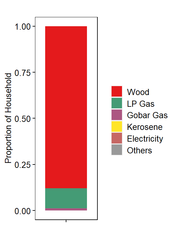
Get Proportion of Households using each FuelType
df <- dat %>%
          dplyr::count(source_cooking_fuel_post_eq, sort=FALSE, name="Freq") %>%
          mutate(Proportion= Freq/sum(Freq))
df$Group <- "Total Household"
df$source_cooking_fuel_post_eq <- factor(df$source_cooking_fuel_post_eq, levels=type_fuel)

head(df)
## # A tibble: 6 x 4
##   source_cooking_fuel_post_eq   Freq Proportion Group
##   <fct>                        <int>      <dbl> <chr>
## 1 Wood                        656207   0.878    Total Household
## 2 LP Gas                       81266   0.109    Total Household
## 3 Gobar Gas                     8807   0.0118   Total Household
## 4 Kerosene                       210   0.000281 Total Household
## 5 Electricity                    189   0.000253 Total Household
## 6 Others                         458   0.000613 Total Household
Plot Proportion of Households by FuelType use
# COLOR PALETTE ---
jColFun <- colorRampPalette(brewer.pal(n = 9, "Set1"))

# PLOT ---
p1 <- ggplot(df, aes(x=Group, y=Proportion)) +
        geom_bar(aes(fill=source_cooking_fuel_post_eq), stat="identity", color=NA, width=0.8, size=0.5) +
        scale_fill_manual(values=jColFun(6)) +
        theme(
          axis.text.x = element_blank(),
          axis.text.y = element_text(size = 10, color="#000000"),
          axis.title = element_text(size = 10, color="#000000"),
          plot.title = element_text(size = 10, color="#000000", hjust=0.5),
          panel.grid.major = element_blank(),
          panel.grid.minor = element_blank(),
          axis.ticks = element_line(size=0.4, color="#000000"),
          strip.text = element_text(size=10, color="#000000"),
          strip.background = element_rect(fill="#FFFFFF", color="#FFFFFF"),
          panel.background = element_rect(fill="#FFFFFF", color="#000000"),
          legend.text = element_text(size = 10, color="#000000"),
          legend.title = element_blank(),
          legend.key.size = unit(0.5, "cm"),
          legend.position = "right") +
      ylab("Proportion of Household") +
      xlab("") +
      ggtitle("")

p1
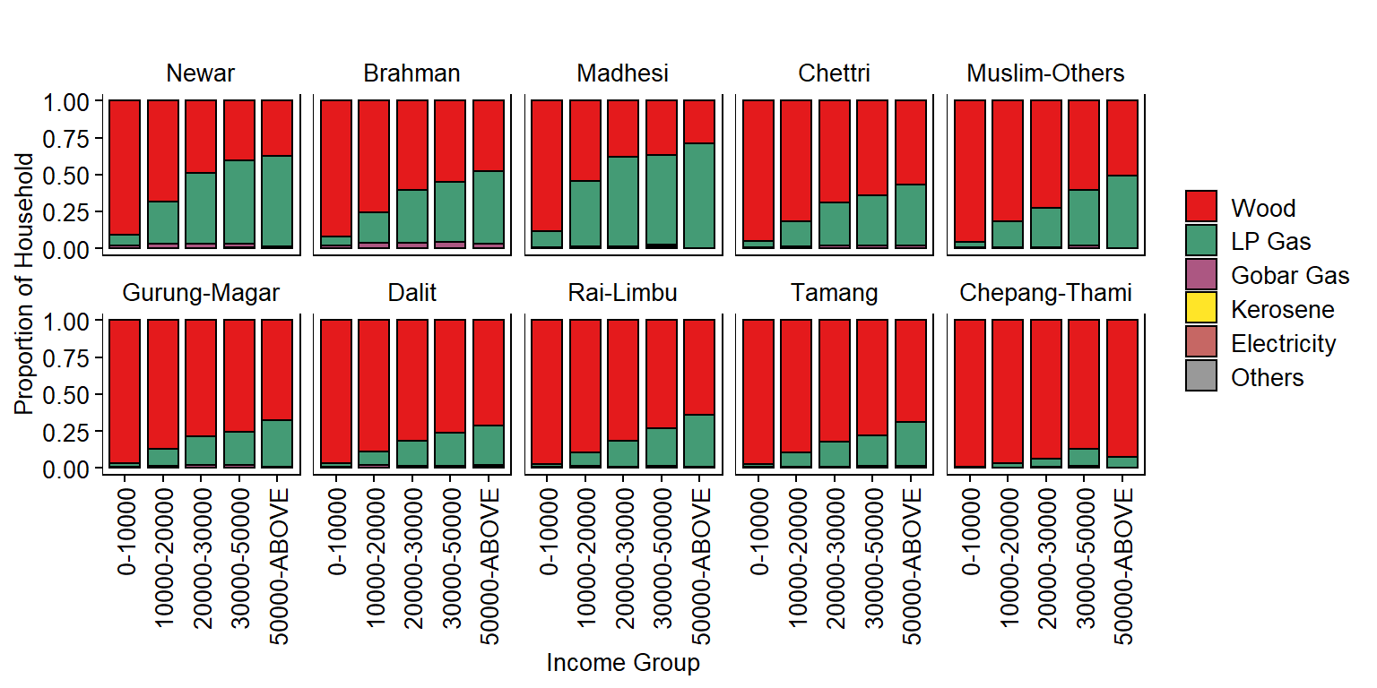
Get Household Proportion by Ethnicity and Income for each FuelType
dm <- dat %>%
          dplyr::count(Ethnicity, IncomeGroup, source_cooking_fuel_post_eq, sort=FALSE, name="Freq") %>%
          group_by(Ethnicity, IncomeGroup) %>%
          mutate(Proportion=Freq/sum(Freq))

dm$source_cooking_fuel_post_eq <- factor(dm$source_cooking_fuel_post_eq, levels=type_fuel)
dm$Ethnicity <- factor(dm$Ethnicity, levels=type_ethnicity)

head(dm)
## # A tibble: 6 x 5
## # Groups:   Ethnicity, IncomeGroup [1]
##   Ethnicity IncomeGroup source_cooking_fuel_post_eq  Freq Proportion
##   <fct>     <chr>       <fct>                       <int>      <dbl>
## 1 Newar     0-10000     Wood                        27747   0.910
## 2 Newar     0-10000     LP Gas                       2268   0.0744
## 3 Newar     0-10000     Gobar Gas                     442   0.0145
## 4 Newar     0-10000     Kerosene                        5   0.000164
## 5 Newar     0-10000     Electricity                    11   0.000361
## 6 Newar     0-10000     Others                         15   0.000492
Plot Household Proportion by Ethnicity and Income for each FuelType
# COLOR PALETTE ---
jColFun <- colorRampPalette(brewer.pal(n = 9, "Set1"))

# PLOT ---
p2 <- ggplot(dm, aes(x=IncomeGroup, y=Proportion)) +
        geom_bar(aes(fill=source_cooking_fuel_post_eq), stat="identity", color="#000000", width=0.8, size=0.5) +
        scale_fill_manual(values=jColFun(6)) +
        facet_wrap(~Ethnicity, ncol=5, scales="fixed", drop=FALSE, strip.position="top") +
        theme(
          axis.text.x = element_text(size = 10, color="#000000", angle=90, hjust=1, vjust=0.5),
          axis.text.y = element_text(size = 10, color="#000000"),
          axis.title = element_text(size = 10, color="#000000"),
          plot.title = element_text(size = 10, color="#000000", hjust=0.5),
          panel.grid.major = element_blank(),
          panel.grid.minor = element_blank(),
          axis.ticks = element_line(size=0.4, color="#000000"),
          strip.text = element_text(size=10, color="#000000"),
          strip.background = element_rect(fill="#FFFFFF", color="#FFFFFF"),
          panel.background = element_rect(fill="#FFFFFF", color="#000000"),
          legend.text = element_text(size = 10, color="#000000"),
          legend.title = element_blank(),
          legend.key.size = unit(0.5, "cm"),
          legend.position = "right") +
      ylab("Proportion of Household") +
      xlab("Income Group") +
      ggtitle("")

p2
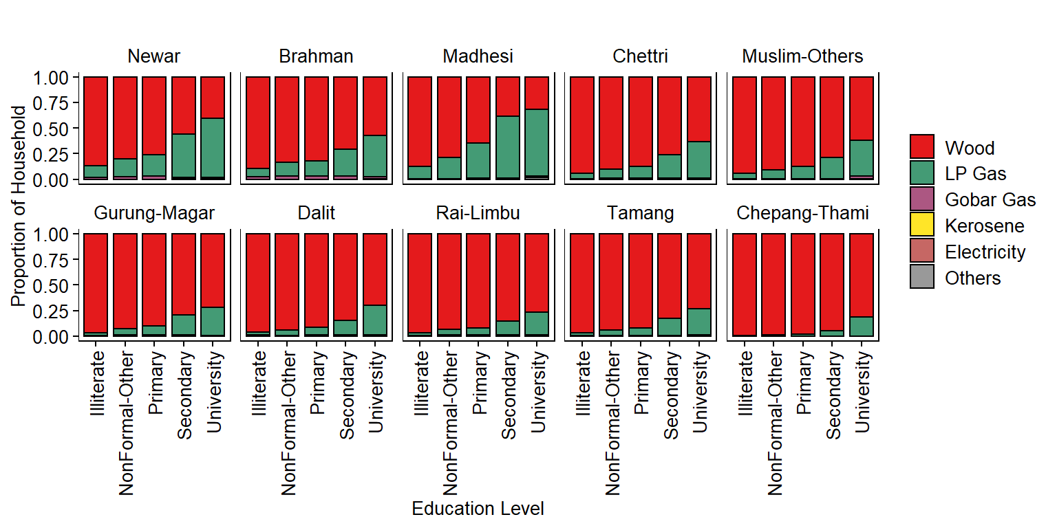
Get Household Proportion by Ethnicity and Education Level for each FuelType
dm <- dat %>%
          dplyr::count(Ethnicity, EducationLevel, source_cooking_fuel_post_eq, sort=FALSE, name="Freq") %>%
          group_by(Ethnicity, EducationLevel) %>%
          mutate(Proportion=Freq/sum(Freq))

dm$source_cooking_fuel_post_eq <- factor(dm$source_cooking_fuel_post_eq, levels=type_fuel)
dm$EducationLevel <- as.factor(dm$EducationLevel)

head(dm)
## # A tibble: 6 x 5
## # Groups:   Ethnicity, EducationLevel [1]
##   Ethnicity EducationLevel source_cooking_fuel_post_eq  Freq Proportion
##   <fct>     <fct>          <fct>                       <int>      <dbl>
## 1 Newar     Illiterate     Wood                        16549   0.867
## 2 Newar     Illiterate     LP Gas                       2207   0.116
## 3 Newar     Illiterate     Gobar Gas                     311   0.0163
## 4 Newar     Illiterate     Kerosene                        3   0.000157
## 5 Newar     Illiterate     Electricity                     5   0.000262
## 6 Newar     Illiterate     Others                          8   0.000419
Plot Household Proportion by Ethnicity and Education Level for each FuelType
# COLOR PALETTE ---
jColFun <- colorRampPalette(brewer.pal(n = 9, "Set1"))

# PLOT ---
p3 <- ggplot(dm, aes(x=EducationLevel, y=Proportion)) +
        geom_bar(aes(fill=source_cooking_fuel_post_eq), stat="identity", color="#000000", width=0.8, size=0.5) +
        scale_fill_manual(values=jColFun(6)) +
        facet_wrap(~Ethnicity, ncol=5, scales="fixed", drop=FALSE, strip.position="top") +
        theme(
          axis.text.x = element_text(size = 10, color="#000000", angle=90, hjust=1, vjust=0.5),
          axis.text.y = element_text(size = 10, color="#000000"),
          axis.title = element_text(size = 10, color="#000000"),
          plot.title = element_text(size = 10, color="#000000", hjust=0.5),
          panel.grid.major = element_blank(),
          panel.grid.minor = element_blank(),
          axis.ticks = element_line(size=0.4, color="#000000"),
          strip.text = element_text(size=10, color="#000000"),
          strip.background = element_rect(fill="#FFFFFF", color="#FFFFFF"),
          panel.background = element_rect(fill="#FFFFFF", color="#000000"),
          legend.text = element_text(size = 10, color="#000000"),
          legend.title = element_blank(),
          legend.key.size = unit(0.5, "cm"),
          legend.position = "right") +
      ylab("Proportion of Household") +
      xlab("Education Level") +
      ggtitle("")

p3
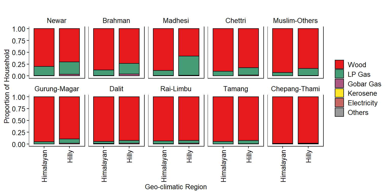
Get Household Proportion by Ethnicity and Geo-climatic Region for each FuelType
dm <- dat %>%
          dplyr::count(Ethnicity, GeoRegion, source_cooking_fuel_post_eq, sort=FALSE, name="Freq") %>%
          group_by(Ethnicity, GeoRegion) %>%
          mutate(Proportion=Freq/sum(Freq))

dm$source_cooking_fuel_post_eq <- factor(dm$source_cooking_fuel_post_eq, levels=type_fuel)
dm$GeoRegion <- factor(dm$GeoRegion, levels=type_geo)

head(dm)
## # A tibble: 6 x 5
## # Groups:   Ethnicity, GeoRegion [1]
##   Ethnicity GeoRegion source_cooking_fuel_post_eq  Freq Proportion
##   <fct>     <fct>     <fct>                       <int>      <dbl>
## 1 Newar     Hilly     Wood                        29914   0.702
## 2 Newar     Hilly     LP Gas                      11324   0.266
## 3 Newar     Hilly     Gobar Gas                    1314   0.0308
## 4 Newar     Hilly     Kerosene                       14   0.000329
## 5 Newar     Hilly     Electricity                    14   0.000329
## 6 Newar     Hilly     Others                         14   0.000329
Plot Household Proportion by Ethnicity and Geo-climatic Region for each FuelType
# COLOR PALETTE ---
jColFun <- colorRampPalette(brewer.pal(n = 9, "Set1"))

# PLOT ---
p4 <- ggplot(dm, aes(x=GeoRegion, y=Proportion)) +
        geom_bar(aes(fill=source_cooking_fuel_post_eq), stat="identity", color="#000000", width=0.8, size=0.5) +
        scale_fill_manual(values=jColFun(6)) +
        facet_wrap(~Ethnicity, ncol=5, scales="fixed", drop=FALSE, strip.position="top") +
        theme(
          axis.text.x = element_text(size = 10, color="#000000", angle=90, hjust=1, vjust=0.5),
          axis.text.y = element_text(size = 10, color="#000000"),
          axis.title = element_text(size = 10, color="#000000"),
          plot.title = element_text(size = 10, color="#000000", hjust=0.5),
          panel.grid.major = element_blank(),
          panel.grid.minor = element_blank(),
          axis.ticks = element_line(size=0.4, color="#000000"),
          strip.text = element_text(size=10, color="#000000"),
          strip.background = element_rect(fill="#FFFFFF", color="#FFFFFF"),
          panel.background = element_rect(fill="#FFFFFF", color="#000000"),
          legend.text = element_text(size = 10, color="#000000"),
          legend.title = element_blank(),
          legend.key.size = unit(0.5, "cm"),
          legend.position = "right") +
      ylab("Proportion of Household") +
      xlab("Geo-climatic Region") +
      ggtitle("")

p4
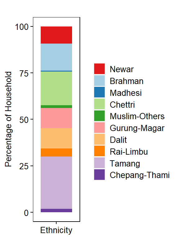
Household Population Distribution by Ethnicity
dm <- dat %>%
        dplyr::count(Ethnicity, sort=TRUE, name="Freq") %>%
        mutate(Percentage= (Freq/sum(Freq)) * 100)
dm$Country <- "Nepal"

# Factorize data
dm$Ethnicity <- factor(dm$Ethnicity, levels=type_ethnicity)

head(dm)
## # A tibble: 6 x 4
##   Ethnicity      Freq Percentage Country
##   <fct>         <int>      <dbl> <chr>
## 1 Tamang       209075      28.0  Nepal
## 2 Chettri      134439      18.0  Nepal
## 3 Brahman      109725      14.7  Nepal
## 4 Gurung-Magar  81840      11.0  Nepal
## 5 Dalit         81436      10.9  Nepal
## 6 Newar         68603       9.18 Nepal
Plot Household Proportion by Ethnicity
# PLOT ---
p5 <- ggplot(dm, aes(x=Country, y=Percentage)) +
        geom_bar(aes(fill=Ethnicity), stat="identity", color=NA, width=0.8, size=0.5) +
        scale_fill_manual(values=cpalette.eth) +
        theme(
          axis.text.x = element_blank(),
          axis.text.y = element_text(size = 10, color="#000000"),
          axis.title = element_text(size = 10, color="#000000"),
          plot.title = element_text(size = 10, color="#000000", hjust=0.5),
          panel.grid.major = element_blank(),
          panel.grid.minor = element_blank(),
          axis.ticks = element_line(size=0.4, color="#000000"),
          strip.text = element_text(size=10, color="#000000"),
          strip.background = element_rect(fill="#FFFFFF", color="#FFFFFF"),
          panel.background = element_rect(fill="#FFFFFF", color="#000000"),
          legend.text = element_text(size = 10, color="#000000"),
          legend.title = element_blank(),
          legend.key.size = unit(0.5, "cm"),
          legend.position = "right") +
      ylab("Percentage of Household") +
      xlab("Ethnicity") +
      ggtitle("")

p5
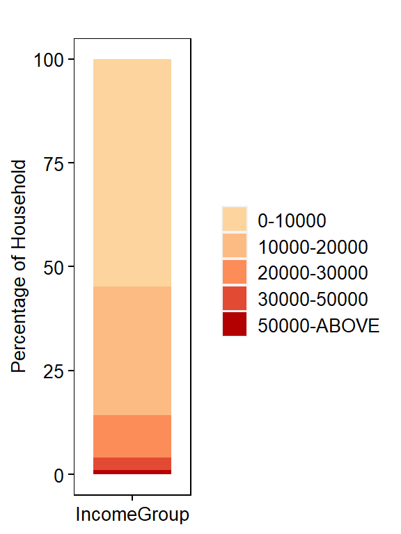
Household Population Distribution by IncomeGroup
dm <- dat %>%
        dplyr::count(IncomeGroup, sort=TRUE, name="Freq") %>%
        mutate(Percentage= (Freq/sum(Freq)) * 100)
dm$Country <- "Nepal"

# Factorize data
dm$IncomeGroup <- as.factor(dm$IncomeGroup)

head(dm)
## # A tibble: 5 x 4
##   IncomeGroup   Freq Percentage Country
##   <fct>        <int>      <dbl> <chr>
## 1 0-10000     409102      54.8  Nepal
## 2 10000-20000 231688      31.0  Nepal
## 3 20000-30000  76124      10.2  Nepal
## 4 30000-50000  21943       2.94 Nepal
## 5 50000-ABOVE   8280       1.11 Nepal
Plot Household Proportion by IncomeGroup
# PLOT ---
p6 <- ggplot(dm, aes(x=Country, y=Percentage)) +
        geom_bar(aes(fill=IncomeGroup), stat="identity", color=NA, width=0.8, size=0.5) +
        scale_fill_manual(values=cpalette.inc) +
        theme(
          axis.text.x = element_blank(),
          axis.text.y = element_text(size = 10, color="#000000"),
          axis.title = element_text(size = 10, color="#000000"),
          plot.title = element_text(size = 10, color="#000000", hjust=0.5),
          panel.grid.major = element_blank(),
          panel.grid.minor = element_blank(),
          axis.ticks = element_line(size=0.4, color="#000000"),
          strip.text = element_text(size=10, color="#000000"),
          strip.background = element_rect(fill="#FFFFFF", color="#FFFFFF"),
          panel.background = element_rect(fill="#FFFFFF", color="#000000"),
          legend.text = element_text(size = 10, color="#000000"),
          legend.title = element_blank(),
          legend.key.size = unit(0.5, "cm"),
          legend.position = "right") +
      ylab("Percentage of Household") +
      xlab("IncomeGroup") +
      ggtitle("")

p6
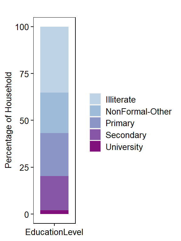
Household Population Distribution by EducationLevel
dm <- dat %>%
        dplyr::count(EducationLevel, sort=TRUE, name="Freq") %>%
        mutate(Percentage= (Freq/sum(Freq)) * 100)
dm$Country <- "Nepal"

# Factorize data
dm$IncomeGroup <- as.factor(dm$EducationLevel)

head(dm)
## # A tibble: 5 x 5
##   EducationLevel    Freq Percentage Country IncomeGroup
##   <chr>            <int>      <dbl> <chr>   <fct>
## 1 Illiterate      263157      35.2  Nepal   Illiterate
## 2 Primary         171947      23.0  Nepal   Primary
## 3 NonFormal-Other 160562      21.5  Nepal   NonFormal-Other
## 4 Secondary       135970      18.2  Nepal   Secondary
## 5 University       15501       2.07 Nepal   University
Plot Household Proportion by EducationLevel
# PLOT ---
p7 <- ggplot(dm, aes(x=Country, y=Percentage)) +
        geom_bar(aes(fill=EducationLevel), stat="identity", color=NA, width=0.8, size=0.5) +
        scale_fill_manual(values=cpalette.edu) +
        theme(
          axis.text.x = element_blank(),
          axis.text.y = element_text(size = 10, color="#000000"),
          axis.title = element_text(size = 10, color="#000000"),
          plot.title = element_text(size = 10, color="#000000", hjust=0.5),
          panel.grid.major = element_blank(),
          panel.grid.minor = element_blank(),
          axis.ticks = element_line(size=0.4, color="#000000"),
          strip.text = element_text(size=10, color="#000000"),
          strip.background = element_rect(fill="#FFFFFF", color="#FFFFFF"),
          panel.background = element_rect(fill="#FFFFFF", color="#000000"),
          legend.text = element_text(size = 10, color="#000000"),
          legend.title = element_blank(),
          legend.key.size = unit(0.5, "cm"),
          legend.position = "right") +
      ylab("Percentage of Household") +
      xlab("EducationLevel") +
      ggtitle("")

p7
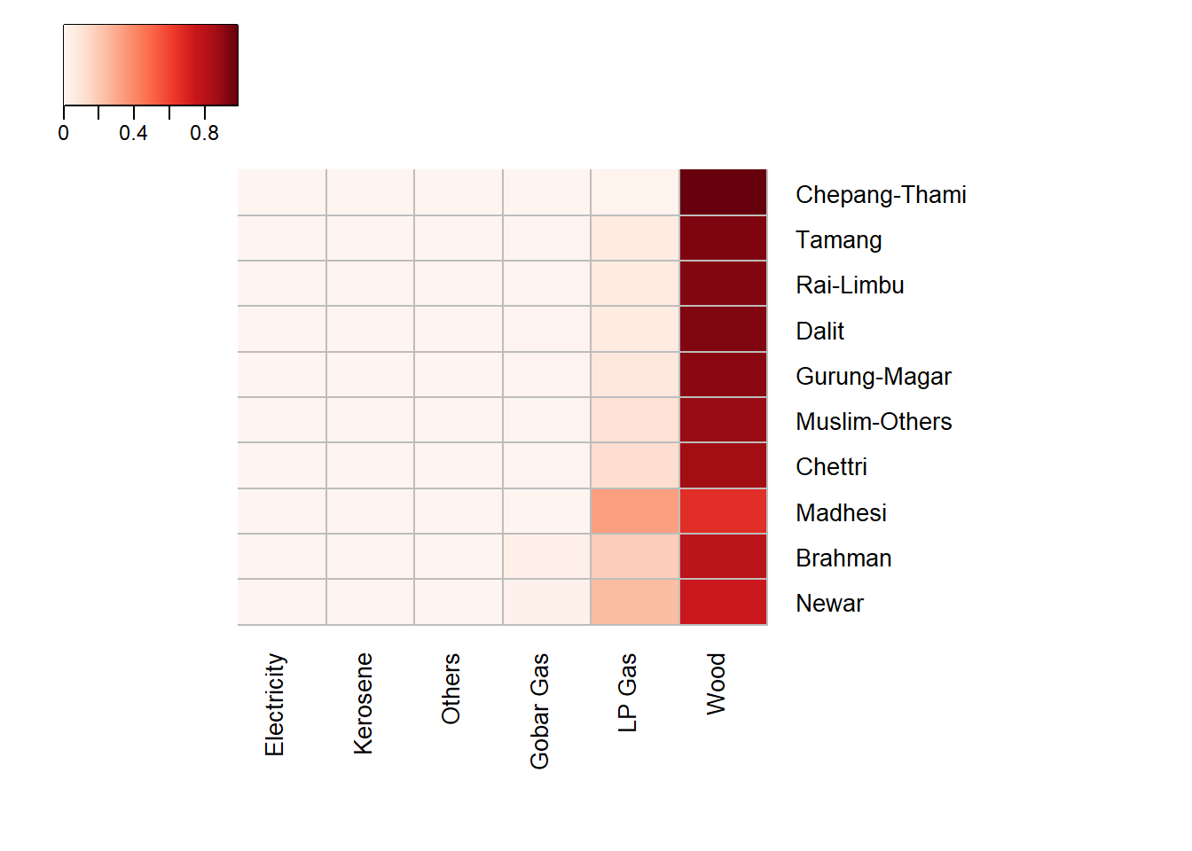
Get Abundance (Number of Households) by Ethnicity and FuelType
df <- dat %>% dplyr::count(Ethnicity, source_cooking_fuel_post_eq, sort=FALSE, name="Freq")
dm <- reshape2::dcast(data=df, formula=Ethnicity ~ source_cooking_fuel_post_eq, fun.aggregate=sum, value.var="Freq")
head(dm)
##       Ethnicity   Wood LP Gas Gobar Gas Kerosene Electricity Others
## 1         Newar  50677  16389      1441       25          39     32
## 2       Brahman  86186  20236      3156       39          30     78
## 3       Madhesi   2501   1263        13        6           5     12
## 4       Chettri 115935  17083      1252       41          48     80
## 5 Muslim-Others   9742   1220        62        2           4      1
## 6  Gurung-Magar  74867   6135       770       18          13     37
Heatmap for Relative Abundance by Ethnicity and FuelType
jColFun <- colorRampPalette(brewer.pal(n = 9, "Reds"))

heatmap.2(as.matrix(dmt), col = jColFun(256), margin=c(8,15),
          Colv=TRUE, Rowv = FALSE, cexRow=1, cexCol=1,
          dendrogram ="none", trace="none", main="",
          hclustfun = function(x) hclust(x, method = "ward.D2"),
          distfun = function(x) dist(x, method = "euclidean"),
          colsep=c(1:50), rowsep=c(1:50),
          sepcolor="#BDBDBD", sepwidth=c(0.0005,0.0005),
          key="TRUE", keysize=1, density.info="none",
          key.title = NA, key.xlab = NA, key.ylab = NA,
          key.par=list(mgp=c(1.5, 0.5, 0), mar=c(2.5, 2.5, 1, 0)))
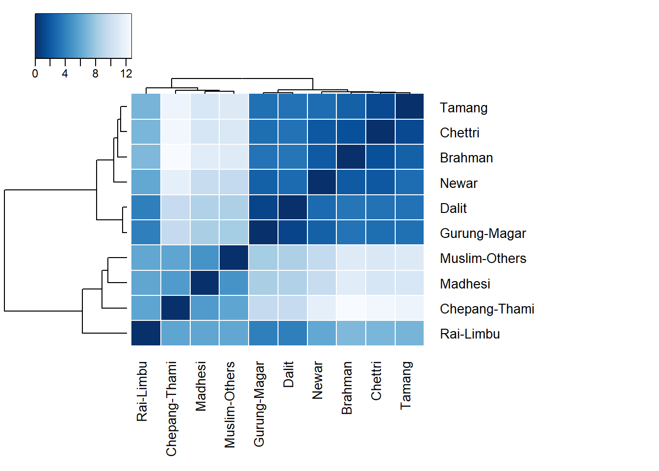
Get Distance Matrix of Ethnicity based on FuelType Usage
# LOG TRANSFORMATION ---
dml <- vegan::decostand(dm[,2:7], "log")
dist_dml <- vegan::vegdist(x=as.matrix(dml), method="euclidean", binary=FALSE, diag=TRUE, upper=TRUE, na.rm = FALSE)
dist_dml <- as.matrix(dist_dml)
colnames(dist_dml) <- rownames(dist_dml) <- dm$Ethnicity
Correlation by Ethnicity
jColFun <- colorRampPalette(brewer.pal(n = 9, "Blues"))

heatmap.2(dist_dml, col=rev(jColFun(256)), margin=c(8,15),
          Colv=TRUE, Rowv = TRUE, cexRow=1, cexCol=1,
          dendrogram ="both", trace="none", main="",
          hclustfun = function(x) hclust(x, method = "ward.D2"),
          distfun = function(x) dist(x, method = "euclidean"),
          colsep=c(1:50), rowsep=c(1:50),
          sepcolor="#FFFFFF", sepwidth=c(0.0005,0.0005),
          key="TRUE", keysize=1, density.info="none", symkey=0,
          key.title = NA, key.xlab = NA, key.ylab = NA,
          key.par=list(mgp=c(1.5, 0.5, 0), mar=c(2.5, 2.5, 1, 0)))